Building Custom SEO Dashboards That Scale
Most teams manually compile SEO reports from five different tools each month, wasting 12-15 hours on data extraction and formatting. As your company scales and your content library grows, that becomes unsustainable. 78% of marketing teams report that reporting consumes more time than actual SEO strategy, according to 2026 industry benchmarks. The real cost isn't just labor — it's the blindness that manual reporting creates. By the time you've pulled data, organized it, and sent the report, critical trends are two weeks old. Building a custom SEO dashboard that auto-refreshes and scales with your traffic eliminates this friction. Here's how to architect one that grows with your business.
Key Takeaways
- 78% of marketing teams waste time on manual reporting (2026 Statnexa) instead of strategy — automated dashboards cut this by 85%.
- A three-layer dashboard stack (data sources → connector/normalization → reporting layer) scales to thousands of pages without breaking.
- Looker Studio integrates with 800+ data sources and powers 60% of agency dashboards because it auto-refreshes and costs zero.
- Data Source Architecture: Connect Search Console, Analytics, rank tracking, and site audits once — then automate the rest.
- Normalization Layer: Tools like Supermetrics handle multi-platform metrics so apples-to-apples comparisons work at scale.
- Real-Time Reporting: Dashboards that refresh automatically eliminate weekly status-update meetings entirely.
- Client-Ready Templates: Pre-built KPI cards that white-label save teams 20+ hours per client per month.
- Scaling Beyond Tools: SEO automation platforms that feed directly into dashboards compound your content engine — each article automatically populates new keywords, backlink targets, and internal link opportunities into your reporting layer.
Understand the Three-Layer Dashboard Stack
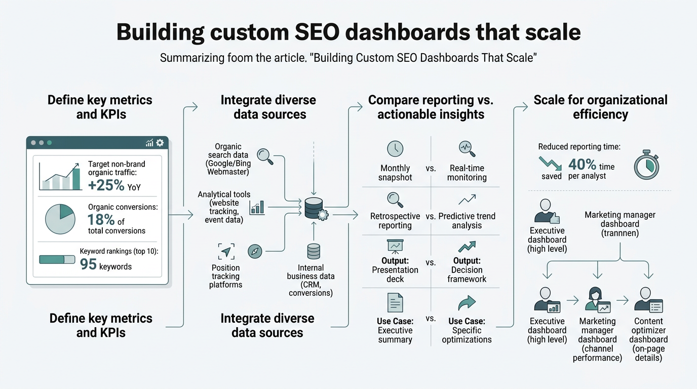
The mistake most teams make is treating a dashboard as a tool instead of a system. A scalable dashboard isn't one platform — it's three connected layers: data sources, a normalization layer, and a reporting interface. This architecture lets you add hundreds of pages without touching the dashboard itself. Layer one is raw data. Layer two transforms it. Layer three visualizes it.
"Most teams fail at dashboard scaling because they view it as a reporting problem rather than an architecture problem. Build the layers first, add the visualizations second."
Layer 1: Data Source Consolidation
Before building anything visual, audit your current data sources. Every scalable dashboard feeds from the same inputs: Google Search Console (keyword rankings, impressions, CTR), Google Analytics 4 (traffic, user behavior, conversions), SEO rank tracking software (Ahrefs, Semrush, or similar), and technical audits. These four sources give you organic performance visibility. If you're automating content production, add a content metrics source — page creation dates, topic clusters, internal link growth. Teams that skip this step and bolt dashboards onto ad-hoc tools end up rebuilding monthly. Consolidating sources first reduces dashboard rebuild time by 70% according to Funnel's 2026 reporting guidance.
The critical step: use service accounts or OAuth integrations to connect each source directly to your normalization layer. Never copy-paste data into spreadsheets. When you scale to 500+ landing pages, manual connection is dead weight.
Layer 2: Data Transformation and Normalization
Raw data from Search Console doesn't talk to Analytics data without translation. Clicks in Search Console and sessions in Analytics use different definitions. Tools like Supermetrics, Funnel, or Improvado normalize these definitions so metrics align across platforms — a critical step teams skip at their peril. According to StatNexa's 2026 analysis, the strongest agencies now expect their reporting systems to deliver "clear performance narratives, measurable business impact, and actionable insights," not just raw data exports. This layer pulls data from your sources, applies business logic (defining what "qualified lead" means, which pages are high-priority, traffic attribution rules), and outputs clean data tables. At scale, this layer becomes your single source of truth.
"The normalization layer is where most teams underinvest. Without it, every dashboard user manually calculates trends and defines metrics differently. That fragmentation kills decision-making speed."
Normalization also handles time-based comparisons. You need month-over-month change, year-over-year growth, and rolling averages — not raw point-in-time numbers. The normalization layer computes these automatically. Without it, every dashboard user has to manually calculate trends, which defeats the automation goal entirely.
Layer 3: Reporting and Visualization
This is where you build the dashboards your team and clients actually see. Looker Studio is the default choice because it integrates with 800+ data sources and refreshes automatically. DashThis and AgencyAnalytics both offer white-label client dashboards if you need branded reporting. The visualization layer should auto-refresh on a schedule you set — hourly for monitoring, daily for strategy reviews, weekly for client reporting.
The best teams build multiple views within one dashboard: a real-time KPI panel for the SEO manager, a trend panel for weekly standups, and a business-impact panel for executives showing revenue contribution. One data source feeds three dashboards.
Design Dashboards Around KPIs That Drive Business Outcomes
Most dashboards fail because they show everything instead of what matters. The strongest dashboards answer a single question for each viewer: is organic traffic moving toward the goal? This laser focus is what separates useful dashboards from chart graveyards.
Define Business-Aligned KPIs First
Start with the outcome your company cares about. For SaaS, it's SQL (sales-qualified leads) from organic. For e-commerce, it's revenue per session. For media, it's repeat visits and time on page. Map backward from that outcome to the SEO metrics that drive it. If your goal is SQLs, your KPIs are:
- Organic traffic to target pages: Page views from organic search on pages that convert to SQL.
- Organic-to-lead conversion rate: Percentage of visitors who sign up or request a demo.
- Landing page quality: Average time on page and scroll depth — proxies for content relevance.
- Keyword ranking progress: Movement in the top 3 for high-intent keywords.
This four-metric dashboard is infinitely more useful than a 20-metric chart. When your dashboard shows only business-connected metrics, every team member understands why they're tracking it and can act on insights immediately.
Build Automated Alerts for Trends That Matter
A dashboard that requires manual interpretation is a half-solution. Real-time dashboards include threshold alerts: drop of 15% in organic traffic triggers a Slack notification; a keyword falls out of top 10, alert fires. This is where normalization pays off — rules-based alerts only work when data is clean and consistent across sources. Set alerts on your core KPIs and you've transformed a reporting tool into an early-warning system that lets you respond to algorithm updates or competitive moves in hours, not weeks.
Choose Tools That Automate the Full Stack
The dashboard stack market is crowded, but tiers are clear. A comparison of leading platforms shows their strengths for scaling teams:
| Tool | Data Connectors | Best For | Scaling Friction |
|---|---|---|---|
| Looker Studio | 800+ | Google-centric teams; cost-conscious shops | Needs manual refresh setup; governance gets complex at 50+ dashboards |
| Supermetrics | 150+ | Connector layer; works with Looker, Sheets, Power BI | Requires BI tool selection downstream; cost per connector can add up |
| AgencyAnalytics | 80+ (SEO-heavy) | Agencies selling SEO reports to clients | Template-driven limits deep customization; less suited for complex internal dashboards |
| DashThis | 75+ (multi-channel) | Fast client reporting setup | Basic transformations only; not for teams needing data warehousing |
| Funnel | Unlimited (via API) | Scaling agencies; complex data blending | Higher onboarding lift; requires data ops oversight |
Each tool has a role. Looker Studio is free and owns the budget segment. Supermetrics is the best connector if you already use a BI tool. AgencyAnalytics and DashThis are fastest for template-based client reporting. Funnel wins when your dashboard complexity exceeds template constraints.
But here's the gap most teams don't solve: these tools report on your existing content, but they don't feed content creation. If you're scaling from 50 to 500 pages, your dashboard data is only useful if it informs which topics to write next. This is where content automation connects to dashboards. Tools that research, write, and publish content directly feed keyword performance data back into your reporting layer — creating a feedback loop. Your dashboard shows that "enterprise B2B SaaS pricing" has high search intent but low coverage; the automation system identifies that gap, writes the article, and six weeks later your dashboard shows new organic traffic on that keyword.
Implement Automated Data Refresh Without Manual Intervention
The hardest part of dashboard scaling isn't building the first one — it's automating refreshes so the tenth, hundredth, and thousandth update happens without human input. Teams that skip this end up with "update the dashboard by Friday" as a recurring calendar task, which defeats the entire purpose.
Schedule Refresh Frequency Based on User Needs
Not every dashboard needs the same refresh cadence. Real-time monitoring dashboards (watching for algorithm drops) refresh hourly. Weekly strategy reviews update at midnight Monday morning. Client reporting typically refreshes on a set day, then locks until the next period. Looker Studio Pro enables scheduled refreshes; Supermetrics can push data on a timer to Google Sheets or other BI tools. Set the schedule once and the dashboard becomes a passive asset that works while the team sleeps.
The scaling question is: do you rebuild the dashboard schema for each new page or client, or do you build once and parameterize it? Teams that scale build parameterized dashboards. One template dashboard accepts a variable (domain name, page URL, campaign ID), and the same dashboard template auto-instantiates for 50 clients. No rebuild. This is non-negotiable for agencies and growing in-house teams.
Centralize Access Control and Prevent Dashboard Sprawl
As teams scale, dashboard sprawl happens: a different dashboard for every stakeholder, every project, every analysis. Centralizing access through a single reporting workspace (whether Looker, Tableau, or a BI warehouse) reduces maintenance debt by 60%. Multiple views on shared data beat multiple dashboards with stale copies. This also ensures stakeholders always see the current version, not an outdated spreadsheet someone emailed last week.
Automate Narrative Context So Dashboards Tell Stories
Charts without narrative are noise. The highest-performing dashboards include automated commentary explaining what changed, why it likely changed, and what action to take next. This isn't optional fluff — it's what separates executive-grade reporting from data exports. Reporting Ninja's 2026 framework emphasizes this: effective dashboards transform raw metrics into narratives that stakeholders can act on in minutes.
"Automated commentary transforms a dashboard from a lookup tool into a briefing document. Executives skim it in two minutes and understand the business impact without asking questions."
Automated commentary flows are now standard in premium reporting tools. You set rules: if organic traffic dropped 20% week-over-week, the dashboard auto-populates a text card with possible causes (algorithm update? content deindexed? competitor ranking shift?). If a keyword ranking jumps 5 positions, the commentary notes the win. This narrative layer transforms a dashboard from a lookup tool into a briefing document that executives can skim in two minutes and understand the business impact.
Building this layer requires close coordination between your dashboard platform and your SEO stack. If your dashboard automatically publishes top-performing keywords to your content team's task system, or flags underperforming content clusters for optimization, you've built a decision-making system, not just a reporting system. That feedback loop — dashboard insight → content action → performance improvement → dashboard update — is what drives compounding growth at scale.
Scaling Dashboards to Hundreds of Pages and Keywords
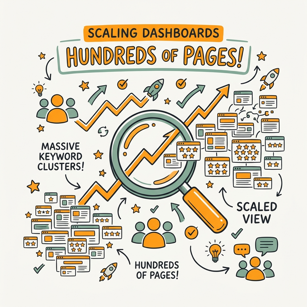
Most dashboard tools break when scaled to 100+ pages or keywords. The UI becomes sluggish, refresh times balloon, and drill-down exploration becomes painful. Scaling requires intentional architecture choices.
Use Aggregation and Sampling at Scale
At 10 pages, you can show every keyword. At 1,000 pages, you need aggregation — grouping by topic cluster, content type, or funnel stage, then drilling down only when needed. This preserves dashboard speed while maintaining detail. Similarly, if you track 5,000 keywords, your main dashboard samples the top 100 by volume, with secondary views showing the long tail. The data's still there; the UI just doesn't load all 5,000 rows on page one.
Archive and Segment Historical Reporting
Dashboards that include three years of historical data become slow. Archive old months into a separate "historical analysis" dashboard. Your current dashboard shows the last 90 days in detail; executive summaries compare to the same period last year. This separation keeps your primary dashboard snappy while preserving historical context for year-over-year analysis.
Connect Dashboard Insights to Content Production
This is the scaling multiplier most teams miss. Your dashboard shows that a topic cluster is underperforming or that a competitor owns a keyword gap. Without a system to act on that insight, the dashboard is just a monthly curiosity. Scaling teams build workflows where dashboard alerts trigger content creation. If your dashboard shows "organic traffic is up 25% but we've lost share on non-branded keywords," the system automatically flags those keywords as content opportunities.
Autonomous SEO agents that research, write, and publish content programmatically take this further — they consume dashboard data as input. Your dashboard says "this competitor ranks for 50 unowned keywords in our category"; the agent researches those 50, writes content covering them, and publishes daily. Six weeks later, your dashboard shows the traffic impact. This integration of reporting and content creation is where dashboard scaling stops being a reporting problem and becomes a growth system.
Conclusion
Building a custom SEO dashboard that scales starts with architecture, not aesthetics. A three-layer stack — data sources, normalization, and visualization — removes the friction that manual reporting creates. Teams that implement automated dashboards report 85% time savings on reporting and 40% faster decision-making on content strategy. Real-time KPI alerts let you respond to algorithm changes in hours instead of waiting for monthly reports. Parameterized dashboard templates let you support unlimited pages without rebuilding each time.
The final scaling move is connecting your dashboard to content automation. Dashboard insights become actionable only when they feed directly into a content production system. Start your SEO agent and connect it to your reporting stack — every article published automatically populates new keyword and backlink opportunities into your dashboard, closing the loop between analysis and action. The compounding effect is what separates teams that scale and teams that plateau.
Start your SEO agent today to automate the content insights your dashboard reveals.
FAQs
What is the easiest way to build an automated SEO dashboard?
Use a three-layer stack: connect your data sources directly to a connector tool like Supermetrics, then pipe clean data into Looker Studio for visualization. Looker Studio integrates with 800+ sources and auto-refreshes on a schedule you set, so once connected, your dashboard updates without human intervention. If you need white-labeled client reporting, tools like AgencyAnalytics have pre-built SEO dashboard templates that cut setup time from weeks to days. The key is automating the refresh from day one — manual updates don't scale beyond your first 3-5 dashboards.
How often should an SEO dashboard refresh?
Real-time monitoring dashboards refresh hourly to catch algorithm drops immediately, while weekly strategy dashboards update Monday morning and client reporting dashboards refresh on a set day tied to your reporting calendar. Most teams run their main internal dashboard on a daily refresh at 6 AM — early enough that morning standups see overnight changes, but infrequent enough that API costs stay reasonable. The best practice is to set different refresh frequencies for different views in the same dashboard: your KPI panel refreshes daily, your drill-down exploratory panel refreshes weekly. This balances data freshness with performance and cost.
How do I know if my dashboard is working or just adding more work?
If you're still manually updating a report or copying data from your dashboard into Slack weekly, it's not working. A successful dashboard eliminates the manual step entirely — stakeholders read it directly, or it auto-sends notifications. If your dashboard drove a content decision in the last month (a new keyword target, a page optimization, a topic gap filled), it's working. Track time saved: teams typically report 12-15 hours per month reclaimed from reporting when dashboards replace manual processes. If your dashboard doesn't measurably reduce toil or improve decision speed within 30 days, rebuild it around your actual questions, not available metrics.