
Site Speed and Mobile Optimization for SEO Success
Google ranks faster websites higher, and 53% of mobile users abandon sites that take more than 3 seconds to load (2025, SteerPoint). When a page slows down by just one second, conversion rates drop by up to 7% per second. Yet most teams treat mobile optimization as an afterthought, optimizing their desktop site and assuming mobile will follow. The stakes are clear: mobile traffic now represents roughly 70% of search behavior, and Google indexes your site mobile-first. The solution isn't complex, but it is non-negotiable. Here's how to align site speed and mobile performance with SEO fundamentals effectively.
Key Takeaways
- 53% of users bounce from slow sites (>3s load time), making mobile speed critical for both user retention and SEO (2025, SteerPoint)
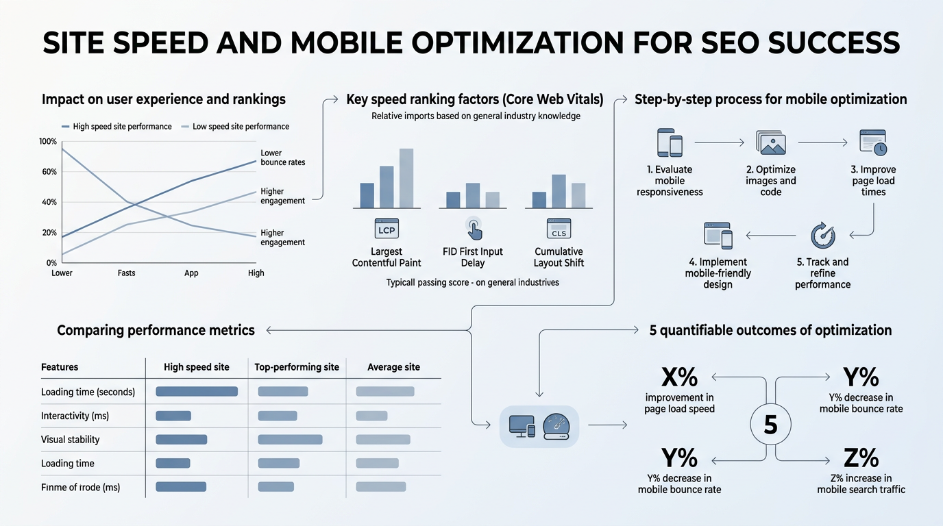
- Core Web Vitals—LCP, INP, and CLS—are Google ranking factors; only 62% of sites pass the mobile LCP threshold (2025)
- Mobile-first indexing means your mobile version determines rankings; desktop performance no longer compensates for poor mobile speed
- Core Web Vitals Benchmarks: Aim for LCP ≤2.5s, INP ≤200ms, and CLS ≤0.1 to pass Google's thresholds and cut bounce rates by 24%.
- Mobile-First Indexing: Google crawls and ranks your mobile version exclusively; mobile speed directly impacts your search rankings.
- Image Optimization: Unoptimized images are the top cause of slow mobile sites; compressing and serving responsive images can shave 2+ seconds off load times.
- Code Minification and Caching: Reducing JavaScript and CSS bloat, plus leveraging browser caching, accelerates page rendering across devices.
- Field Data vs. Lab Testing: Google uses real-user CrUX data (75th percentile) for rankings, not lab scores; monitor actual mobile performance, not just Lighthouse metrics.
Why Mobile Speed Is Non-Negotiable for Modern SEO
Mobile speed is a confirmed ranking factor. A 1-second delay in mobile load time reduces conversions by 7%, and pages passing all Core Web Vitals thresholds see a 24% drop in bounce rates compared to those that fail (2025, Ahrefs/Google). This isn't just about user experience anymore—it's a competitive edge. When two sites have similar content quality, the faster one wins in Google's mobile-first rankings.
"Mobile-first indexing means Google crawls and ranks your mobile version exclusively. What feels snappy on a MacBook may crawl on a mid-range Android phone over 4G."
The mobile-first indexing shift (which Google fully implemented years ago) means your desktop speed is almost irrelevant for rankings. Google crawls and indexes your mobile version exclusively. Many teams still design fast desktop experiences and assume mobile will be fine. It won't. Mobile devices have slower processors, limited bandwidth (especially on 4G), and lower RAM than desktops. What feels snappy on a MacBook may crawl on a mid-range Android phone over 4G.
The Real Cost of Slow Mobile Performance
Beyond rankings, slow mobile sites leak conversions, trust, and brand perception. Nearly 80% of users prefer and are more likely to return to user-friendly mobile sites (2025, Google). When users experience slow load times, they don't wait. They tap the back button and search for a competitor. Each second of delay compounds the damage:
- 0–1 second: Baseline. Users expect this.
- 1–3 seconds: Acceptable but risky. Bounce rates climb with each millisecond.
- 3+ seconds: Critical failure. 53% of mobile users abandon the site immediately.
For e-commerce and lead-gen sites, this translates to direct revenue loss. For organic traffic, slow sites also pile up higher bounce rates, which signals to Google that the content isn't meeting user intent—further tanking rankings.
How Speed Influences Google's Ranking Algorithm Today
Google confirmed Core Web Vitals as a ranking factor in 2021, and they've remained a tie-breaker ever since. When two pages have similar content quality, the faster page ranks higher. But the relationship is subtle. Speed isn't a knockout factor like content relevance is—it's a nudge toward pages with better user experience signals. If your SEO content plan doesn't account for speed optimization, you're leaving rankings on the table.
What matters most isn't raw speed; it's real-world speed. Google measures performance via the Chrome User Experience Report (CrUX), which captures actual user data from Chrome browsers. Your Lighthouse lab score is useful for diagnostics, but Google ranks based on the 75th percentile of real-user sessions. If your site is fast in the lab but slow in the field, Google knows. Monitor field data, not just synthetic tests.
Mastering Core Web Vitals for SEO and User Experience

Core Web Vitals are three metrics that measure how users experience a page in real time: Largest Contentful Paint (LCP) measures loading speed, Interaction to Next Paint (INP) measures responsiveness, and Cumulative Layout Shift (CLS) measures visual stability. Only 62% of mobile sites pass LCP, 77% pass INP, and 81% pass CLS (2025, Core Web Vitals.io). That's your window to stand out.
Largest Contentful Paint (LCP): Perceived Load Speed
LCP measures the time it takes for the largest visible element (image, text block, video) to render on screen. Google's threshold for "good" is ≤2.5 seconds. Most sites fail because they prioritize large hero images, unoptimized videos, or render-blocking JavaScript above the fold.
"Unoptimized images are the #1 culprit for slow mobile loads. Serving responsive images for different devices and using modern formats like WebP can cut seconds from your load time and directly improve your rankings."
To improve LCP, start with images. Unoptimized images are the #1 culprit for slow mobile loads. Serve responsive images (different sizes for different devices), use modern formats like WebP, and compress aggressively. Next, defer non-critical JavaScript. If a script doesn't need to load immediately, defer it. Finally, improve server response time (Time to First Byte). A slow server is a bottleneck no client-side optimization can overcome.
Interaction to Next Paint (INP): Responsiveness
INP replaced First Input Delay (FID) as Google's responsiveness metric. It measures the time between a user interaction (click, tap, keyboard input) and when the browser paints the visual response. The threshold is ≤200 milliseconds. Most failures are JavaScript execution problems. Heavy JavaScript blocks the main thread, making the page feel sluggish.
Reduce INP by minimizing JavaScript, breaking up long tasks (over 50ms of continuous execution), and avoiding excessive DOM manipulation. A practical win: audit your third-party scripts. Analytics, chat widgets, and ad networks often ship bloated code. Lazy-load them if possible.
Cumulative Layout Shift (CLS): Visual Stability
CLS measures unexpected layout shifts during the page load. When ads load late, fonts swap, or images pop in without reserved space, CLS increases. The threshold is ≤0.1. Mobile sites are more prone to CLS because smaller viewports make layout instability more noticeable.
Fix CLS by reserving space for dynamic content, setting explicit dimensions on images and iframes, and avoiding injecting content above existing content. Font swaps are another culprit—use `font-display: swap` in your CSS to prevent invisible text while web fonts load.
Mobile Optimization Beyond Core Web Vitals

Core Web Vitals capture three important dimensions of user experience, but they're not the whole story. Mobile optimization also covers responsive design, touch usability, and safe browsing—all factors Google considers directly or indirectly for rankings. Many teams underestimate how much SEO AI agents can help enforce mobile optimization practices across hundreds of pages, but the foundation must be right first.
Responsive Design and Mobile-First Layout
Responsive design is table stakes now. Every site must adapt fluid to different screen sizes. But true mobile-first design goes further. Build your layout for mobile first—the smallest, most constrained experience—then enhance it for larger screens. This forces you to prioritize content and cut unnecessary bloat.
Test your responsive design on real devices, not just browser dev tools. Simulate real network conditions (3G, 4G, 5G) to see how your site behaves. A page that feels snappy on your office WiFi may choke on a commuter's cellular connection. Tools like Chrome DevTools let you throttle network speed. Use them.
Touch Usability and Interactive Elements
Mobile users interact via touch, not mouse clicks. Buttons and links need adequate spacing—Google recommends at least 48x48 pixels for touch targets. Avoid hover-dependent interactions that don't work on touch. Ensure forms are mobile-friendly: large input fields, clear labels, and a single-column layout whenever possible.
Text should be readable without zooming. Use at least 16px font size for body text. On mobile, zooming is a sign of a poorly designed page. If users have to zoom to read, your mobile optimization is incomplete.
Safe Browsing and Mobile Security
Google also factors in security. Sites with malware, phishing, or intrusive interstitials (pop-ups that block content) are demoted in rankings or flagged in search results. On mobile, full-page interstitials are particularly punitive. If your mobile site shows a pop-up before the user can see content, Google penalizes you. Use these sparingly and only after the user has engaged.
Practical Site Speed Optimization Techniques
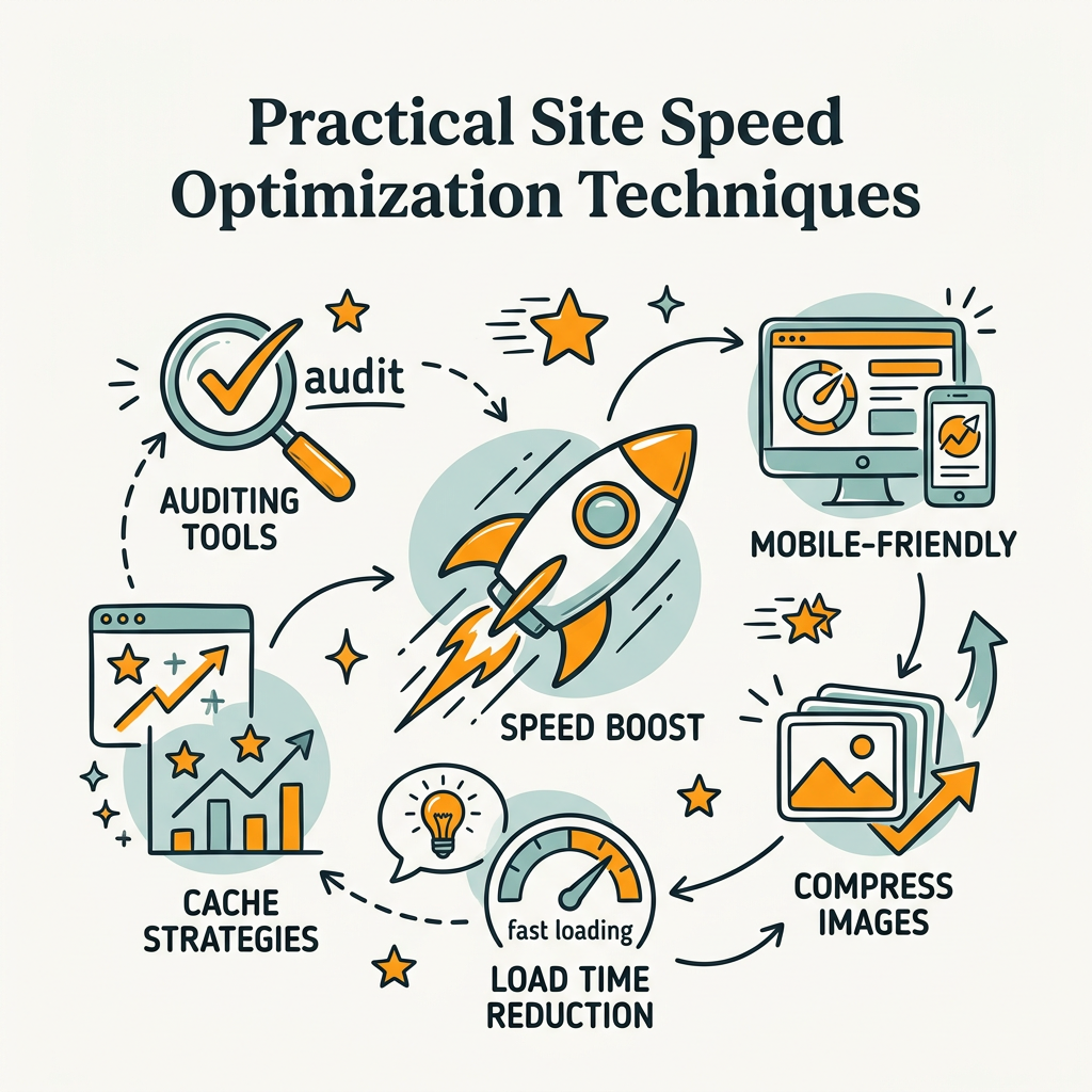
Optimizing site speed is methodical. Start with audits, identify bottlenecks, and prioritize fixes by impact. Don't try to optimize everything at once.
Audit and Benchmark with Real Tools
Begin with Google PageSpeed Insights, which shows your field data (real users via CrUX) alongside lab data (Lighthouse synthetic tests). If field data is poor, focus there first. Also monitor the Chrome User Experience Report to track your performance over time at the 75th percentile.
Waterfall charts and performance timelines in Chrome DevTools are invaluable for finding what's blocking page rendering. Look for large JavaScript bundles, render-blocking CSS, and unoptimized images.
Image Optimization Strategy
Images typically account for 50%+ of page weight. Optimize aggressively:
- Compress: Use tools like ImageOptim or TinyPNG to reduce file size without visible quality loss.
- Serve Responsive: Use the `srcset` attribute to serve different image sizes for mobile vs. desktop.
- Modern Formats: Serve WebP to modern browsers; fall back to JPEG/PNG for older ones.
- Lazy Load: Defer off-screen images with the `loading="lazy"` attribute; they load only when the user scrolls near them.
JavaScript and CSS Optimization
JavaScript is the biggest culprit for slow interactive performance. Audit your bundle size. If it's over 200KB, you have bloat. Strategies to reduce it:
- Code Splitting: Load only the JavaScript needed for the current page, not your entire app.
- Remove Unused CSS: Unused CSS adds weight. Use tools like PurgeCSS or coverage reports in DevTools to identify and eliminate it.
- Minify: Compress JavaScript and CSS. Every tool does this now; ensure your build process is configured.
- Defer Non-Critical Scripts: Analytics, chat widgets, and recommendation engines don't need to load synchronously. Defer them.
Hosting and Infrastructure Choices
Server response time (Time to First Byte, or TTFB) sets the floor for all other optimizations. A slow server can't be outpaced by front-end tweaks. Consider:
- CDN (Content Delivery Network): Serve static assets from servers geographically close to users. A CDN can cut TTFB in half.
- Server Upgrades: If you're on shared hosting, upgrade to VPS or managed hosting. Shared hosting is slow.
- Caching Strategy: Browser caching (tell browsers to cache assets locally) and server-side caching (cache database queries, rendered pages) both help.
| Optimization Area | Impact on LCP | Impact on INP | Impact on CLS | Typical Effort |
|---|---|---|---|---|
| Image Compression & Responsive Images | Very High (1-3s improvement) | Low | Medium | Medium (hours) |
| Remove Render-Blocking JavaScript | High (0.5-2s) | Very High (50-150ms) | Low | Medium to High |
| Upgrade Hosting / CDN | Very High (0.3-1.5s) | Low | Low | Low (minutes to configure) |
| Browser Caching | Medium (helps repeat visits) | Low | Low | Low (simple header config) |
| Reserve Space for Images/Ads (CLS Fix) | Low | Low | Very High (0.05-0.2 improvement) | Low (CSS fixes) |
| Code Splitting & Minification | Medium | Very High (30-100ms) | Low | High (refactoring) |
Content Strategy and Site Speed: A Symbiotic Relationship
Speed optimization and content strategy aren't separate disciplines—they're intertwined. When you commit to fast sites, you're also committing to lean content and intentional design. This naturally aligns with what Google rewards: pages that serve users, not bloated marketing websites.
Lean Content and Focused Pages
Slow sites often suffer from bloated pages. Every hero image, auto-playing video, and third-party widget adds weight. Ask: Does this element serve the user's intent on this page? If not, remove it. A focused page that loads in 2 seconds beats a flashy page that takes 6 seconds, every time. Users and Google both prefer clarity and speed over visual excess.
Building SEO Content at Scale Without Compromising Speed
Many content marketing teams face a paradox: producing more content often means slower sites (more pages, more assets, more requests). This is solvable through automation. Tools that help you research, write, and publish SEO content without manual overhead—like autonomous SEO agents—can compound your organic traffic while you maintain speed discipline. The best content automation tools don't just produce articles—they enforce best practices like optimized images and lean markup. Jottler, for example, produces 3,000+ word SEO articles daily, handling keyword research and fact-checking, all while your development team keeps page weight and performance optimized. The result is a fast, content-rich site that scales without founder burnout.
The key is treating performance as a non-negotiable constraint in your content workflow, not an afterthought. Optimize images before publishing. Lazy-load videos. Set dimensions on all media upfront. These practices compound over hundreds of articles.
Monitoring and Continuous Improvement
Optimization is not a one-time project. Sites degrade over time as new features, third-party scripts, and content accumulate. Set up continuous monitoring.
Real User Monitoring (RUM) and Alerting
Don't rely on synthetic tests alone. Implement Real User Monitoring (RUM) to track how your site performs for actual visitors. Many analytics platforms now include basic performance metrics. If they don't, use a dedicated RUM tool. Set alerts for when Core Web Vitals drift below thresholds. A one-second regression in LCP might seem small, but it translates to lost rankings and conversions.
Competitive Benchmarking
Check how your top organic competitors perform. Tools like PageSpeed Insights work on any public URL. If a competitor consistently beats you by 500ms on mobile LCP, they may have a hosting or image strategy worth investigating. Speed is a competitive moat—invest in it accordingly.
Testing Changes Before Deployment
Before pushing site changes live, test performance impact in staging. Did a new feature add 100KB of JavaScript? Did the designer's new hero image add 2 seconds to LCP? Catch these regressions before users see them. Most teams don't measure this. Those that do get a systematic edge in both UX and rankings.
Conclusion
Site speed and mobile optimization are no longer nice-to-have extras in your SEO strategy—they're foundational. Google explicitly ranks faster mobile sites higher, and 53% of users abandon slow experiences. The competitive advantage belongs to teams that view performance as core to their organic strategy, not a technical afterthought. Core Web Vitals (LCP ≤2.5s, INP ≤200ms, CLS ≤0.1) are your roadmap. Focus on mobile first, audit with real-user data from CrUX, and prioritize image optimization and JavaScript reduction. The path to better rankings runs through faster pages. Ready to move faster? Start your SEO agent and build an automated content strategy that scales without compromising performance.
FAQs
Does page speed really affect SEO rankings?
Yes. Page speed is a confirmed ranking factor, and it acts as a tie-breaker when content quality is similar. When two pages have comparable content, the faster page ranks higher. Additionally, slow pages accumulate higher bounce rates, which signals to Google that the page isn't meeting user intent—further damaging rankings. A one-second delay in load time reduces conversions by 7%, so the impact spans both SEO and revenue. Monitor your Core Web Vitals, not just raw load time, since Google uses real-user experience data (CrUX) to determine your ranking position.
What is mobile-first indexing and why does it matter?
Mobile-first indexing means Google crawls and ranks your mobile site version exclusively. Your desktop site is no longer the primary version Google uses to determine rankings. This shift happened because most search traffic now comes from mobile devices. If your mobile site is slow, poorly designed, or missing content, your rankings will suffer—even if your desktop site is fast and feature-complete. Optimize your mobile experience first and assume it will be your primary ranking signal. Desktop optimization should follow, not precede, mobile improvements.
What are the most impactful site speed optimizations I can make right now?
Start with image optimization, which typically delivers the fastest ROI. Compress all images, serve responsive versions for different device sizes, and use modern formats like WebP. Second, remove render-blocking JavaScript—audit your third-party scripts (analytics, chat widgets, ads) and defer any that don't need to load immediately. Third, upgrade your hosting or add a CDN to improve server response time (TTFB). These three changes alone can cut mobile load time by 2-3 seconds and directly improve your Core Web Vitals scores, which Google rewards with better rankings and users reward with lower bounce rates.